
I spent a little time this weekend tidying up the look of my Etsy store, Handmade by Amo'r. I pared back the background variations for a more streamlined look.
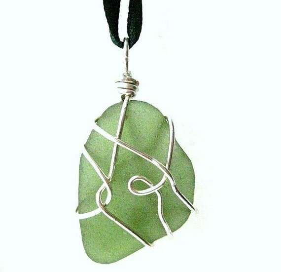 |
| Irish sea glass sun catcher |
I have always used maybe 5 or more different back grounds for my main pictures, white being the more frequently used as it makes the items pop. Good photos against a white background also gets me into a decent amount of treasuries so I will continue using this for most of my listings.
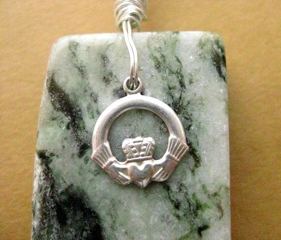 |
| Connemara marble and sterling silver |
However, certain shades need a bit of colour to stand out. The mid-tone varieties of Connemara marble just will not turn out right for me against a white background. I have found it easier to get a truer depiction of the actual colour if photographed against a pale brown background. Paler pinks, seafoam sea glass and some other shades also tend to do better against the plain tan backdrop.
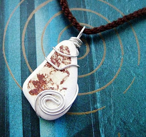 |
| blue background soon to be completely banished from my main pics |
Up to now I have also experimented with blue backgrounds, pages of text etc etc. The one above featured in a lot of my listings as it also works with Connemara marble, whites, pinks, purples and aqua sea glass. However it's time to banish it from the main photos!
So yesterday I took a hard look at my shop and concluded that it had lost the run of itself and didn't appear very cohesive. Time to scale down and tidy up!
I decided to stick to white and a couple of different brown backgrounds as the running theme. My earrings mostly hang off a brown bowl against a white background and I intend to keep that image as it still ties in with the general scheme of things.
I happily discovered that in nearly all the listings there already existed a suitable photo to bump up to the front. I just had to switch them over to the main pic. There are still a couple of items that need to be re-shot but I hope you agree that the shop is looking a lot more streamlined already without me taking any new photos at all. (Don't you just love it when you realise you already have what you were looking for?)

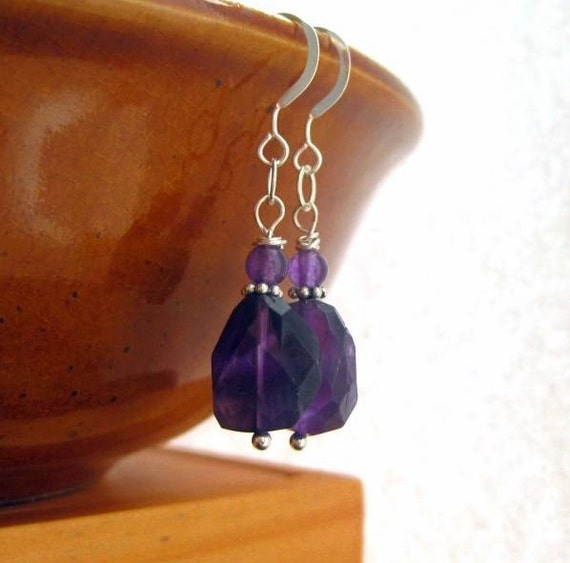 |
| Amethyst earrings |
I happily discovered that in nearly all the listings there already existed a suitable photo to bump up to the front. I just had to switch them over to the main pic. There are still a couple of items that need to be re-shot but I hope you agree that the shop is looking a lot more streamlined already without me taking any new photos at all. (Don't you just love it when you realise you already have what you were looking for?)

Any well-intended photography or shop makeover critiques or hints will always be welcomed in the comments!
In my opinion AM ,sometimes we have to choose between being in a lot of Tresury lists or to show properly one piece ... sometimes on white background the jewelry can not being understand well (no hay relieve ).. is just my opinion , when you said :
ReplyDelete'certain shades need a bit of colour to stand out '
I fully agree .. I think we should looking for more convenient in each case, can not be generalized.
Hola Margarita. Thanks for your comment. (no hay relieve - it doesnt stand out...I did not know how to say that in Spanish, so thank you for the new vocab!)
DeleteYour shop is looking great Anne-Marie, really clean and crisp.
ReplyDeleteAmy
thanks Amy. Bit better alright.
DeleteWell done, your shop looks very nice! It's definitely not an easy job not only to take photos which will look good but also will result in sales.
ReplyDeletethanks. And the 3rd part of the challenge is keeping the colours true. Some can be very hard to photograph and because of the range of tones within one small piece, Connemara marble is a bit of a nightmare to capture, especially the mid-greens and paler yellowy ones. Purple is another hard one. It comes out blue sometimes.
Delete